Background
In today’s mini-project we will analyze candy data with exploratory graphics , basic statisticss , correlation analysis and principal componenet analysis methods we have been learning thus far.
Data Import
The data comes as a CSV file from 538.
<- ("candy-data.csv" )= read.csv (candy_file, row.names= 1 )head (candy)
             chocolate fruity caramel peanutyalmondy nougat crispedricewafer
100 Grand            1      0       1              0      0                1
3 Musketeers         1      0       0              0      1                0
One dime             0      0       0              0      0                0
One quarter          0      0       0              0      0                0
Air Heads            0      1       0              0      0                0
Almond Joy           1      0       0              1      0                0
             hard bar pluribus sugarpercent pricepercent winpercent
100 Grand       0   1        0        0.732        0.860   66.97173
3 Musketeers    0   1        0        0.604        0.511   67.60294
One dime        0   0        0        0.011        0.116   32.26109
One quarter     0   0        0        0.011        0.511   46.11650
Air Heads       0   0        0        0.906        0.511   52.34146
Almond Joy      0   1        0        0.465        0.767   50.34755
Q1. How many different candy types are in this dataset?
Q2. How many fruity candy types are in the dataset?
Q3. What is your favorite candy (other than Twix) in the dataset and what is it’s winpercent value?
"Nestle Crunch" , ]$ winpercent
Q4. What is the winpercent value for “Kit Kat”?
"Kit Kat" , ]$ winpercent
Q5. What is the winpercent value for “Tootsie Roll Snack Bars”?
"Tootsie Roll Snack Bars" , ]$ winpercent
Q6. Is there any variable/column that looks to be on a different scale to the majority of the other columns in the dataset?
library ("skimr" )skim (candy)
Data summary
Name
candy
Number of rows
85
Number of columns
12
_______________________
Column type frequency:
numeric
12
________________________
Group variables
None
Variable type: numeric
chocolate
0
1
0.44
0.50
0.00
0.00
0.00
1.00
1.00
▇▁▁▁▆
fruity
0
1
0.45
0.50
0.00
0.00
0.00
1.00
1.00
▇▁▁▁▆
caramel
0
1
0.16
0.37
0.00
0.00
0.00
0.00
1.00
▇▁▁▁▂
peanutyalmondy
0
1
0.16
0.37
0.00
0.00
0.00
0.00
1.00
▇▁▁▁▂
nougat
0
1
0.08
0.28
0.00
0.00
0.00
0.00
1.00
▇▁▁▁▁
crispedricewafer
0
1
0.08
0.28
0.00
0.00
0.00
0.00
1.00
▇▁▁▁▁
hard
0
1
0.18
0.38
0.00
0.00
0.00
0.00
1.00
▇▁▁▁▂
bar
0
1
0.25
0.43
0.00
0.00
0.00
0.00
1.00
▇▁▁▁▂
pluribus
0
1
0.52
0.50
0.00
0.00
1.00
1.00
1.00
▇▁▁▁▇
sugarpercent
0
1
0.48
0.28
0.01
0.22
0.47
0.73
0.99
▇▇▇▇▆
pricepercent
0
1
0.47
0.29
0.01
0.26
0.47
0.65
0.98
▇▇▇▇▆
winpercent
0
1
50.32
14.71
22.45
39.14
47.83
59.86
84.18
▃▇▆▅▂
The “winpercent” variable looks like it is on a different scale because the numbers it has for each column are a lot larger than the other variables.
Q7. What do you think a zero and one represent for the candy$chocolate column?
 [1] 1 1 0 0 0 1 1 0 0 0 1 0 0 0 0 0 0 0 0 0 0 0 1 1 1 1 0 1 1 0 0 0 1 1 0 1 1 1
[39] 1 1 1 0 1 1 0 0 0 1 0 0 0 1 1 1 1 0 1 0 0 1 0 0 1 0 1 1 0 0 0 0 0 0 0 0 1 1
[77] 1 1 0 1 0 0 0 0 1
The “0” likely represents a candy that doesn’t have any chocolate while the “1” represents candy that does have chocolate in it.
Exploratory Analysis
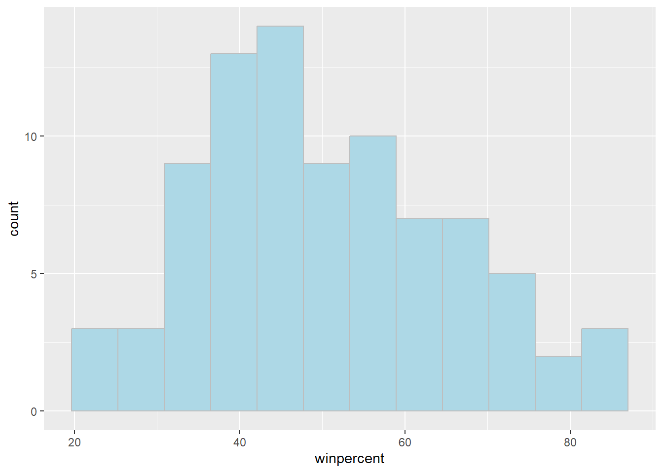
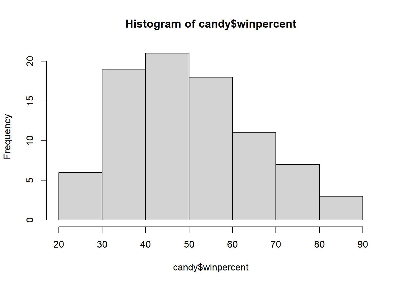
Q8. Plot a histogram of winpercent values using both base R an ggplot2.
library (ggplot2)ggplot (candy) + aes (winpercent) + geom_histogram (bins= 12 , fill= "lightblue" , col= "gray" )
hist (candy$ winpercent, breaks= 8 )
Q9. Is the distribution of winpercent values symmetrical?
The distribution is not symmetrical
Q10. Is the center of the distribution above or below 50%?
summary (candy$ winpercent)
   Min. 1st Qu.  Median    Mean 3rd Qu.    Max.
  22.45   39.14   47.83   50.32   59.86   84.18
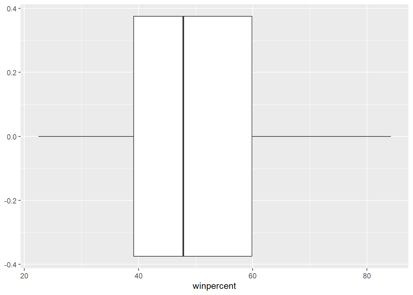
ggplot (candy) + aes (winpercent) + geom_boxplot ()
The center of the distribution is below 50%
Q11. On average is chocolate candy higher or lower ranked than fruit candy?
Steps to solve this: 1.Find all chocolate candy in the dataset 2.Extract or find their winpercent values 3.Calculate the mean of these values
4.Find all fruit candy in the data set 5.Find their winpercent 6.Calculate their mean value
<- candy[ candy$ chocolate== 1 , ]<- chocolate_can$ winpercentmean (choc.win)
<- candy[ candy$ fruity== 1 , ]<- fruit_can$ winpercentmean (fruit.win)
chocolate candy on average is higher ranked than fruit candy.
Q12. Is this difference statistically significant?
t.test (choc.win, fruit.win)
    Welch Two Sample t-test

data:  choc.win and fruit.win
t = 6.2582, df = 68.882, p-value = 2.871e-08
alternative hypothesis: true difference in means is not equal to 0
95 percent confidence interval:
 11.44563 22.15795
sample estimates:
mean of x mean of y
 60.92153  44.11974
The difference between these two candies is statistically significant
Overall Candy Rankings
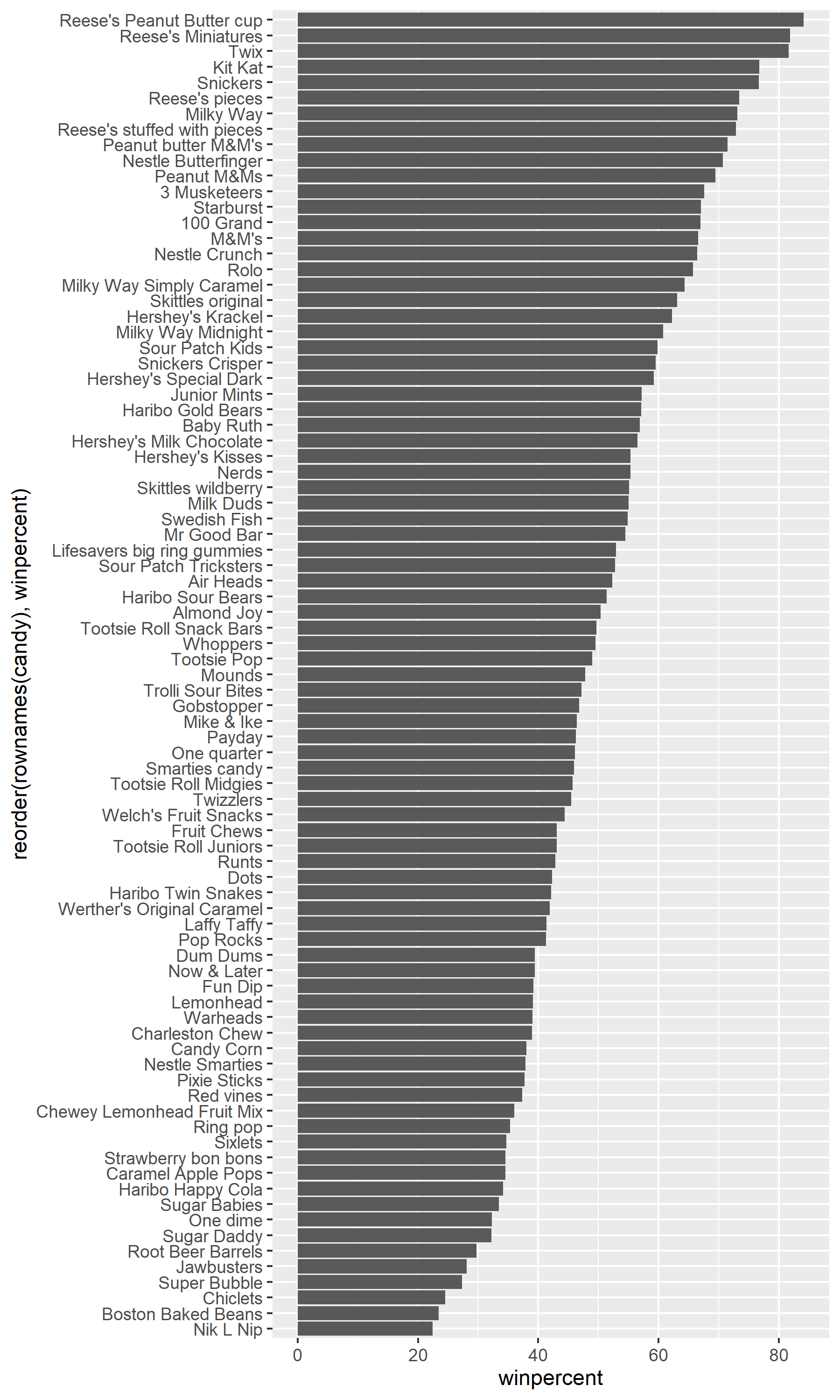
Q13. What are the five least liked candy types in this set?
head (candy[order (candy$ winpercent),], n= 5 )
                   chocolate fruity caramel peanutyalmondy nougat
Nik L Nip                  0      1       0              0      0
Boston Baked Beans         0      0       0              1      0
Chiclets                   0      1       0              0      0
Super Bubble               0      1       0              0      0
Jawbusters                 0      1       0              0      0
                   crispedricewafer hard bar pluribus sugarpercent pricepercent
Nik L Nip                         0    0   0        1        0.197        0.976
Boston Baked Beans                0    0   0        1        0.313        0.511
Chiclets                          0    0   0        1        0.046        0.325
Super Bubble                      0    0   0        0        0.162        0.116
Jawbusters                        0    1   0        1        0.093        0.511
                   winpercent
Nik L Nip            22.44534
Boston Baked Beans   23.41782
Chiclets             24.52499
Super Bubble         27.30386
Jawbusters           28.12744
Q14. What are the top 5 all time favorite candy types out of this set?
tail (candy[order (candy$ winpercent),], n= 5 )
                          chocolate fruity caramel peanutyalmondy nougat
Snickers                          1      0       1              1      1
Kit Kat                           1      0       0              0      0
Twix                              1      0       1              0      0
Reese's Miniatures                1      0       0              1      0
Reese's Peanut Butter cup         1      0       0              1      0
                          crispedricewafer hard bar pluribus sugarpercent
Snickers                                 0    0   1        0        0.546
Kit Kat                                  1    0   1        0        0.313
Twix                                     1    0   1        0        0.546
Reese's Miniatures                       0    0   0        0        0.034
Reese's Peanut Butter cup                0    0   0        0        0.720
                          pricepercent winpercent
Snickers                         0.651   76.67378
Kit Kat                          0.511   76.76860
Twix                             0.906   81.64291
Reese's Miniatures               0.279   81.86626
Reese's Peanut Butter cup        0.651   84.18029
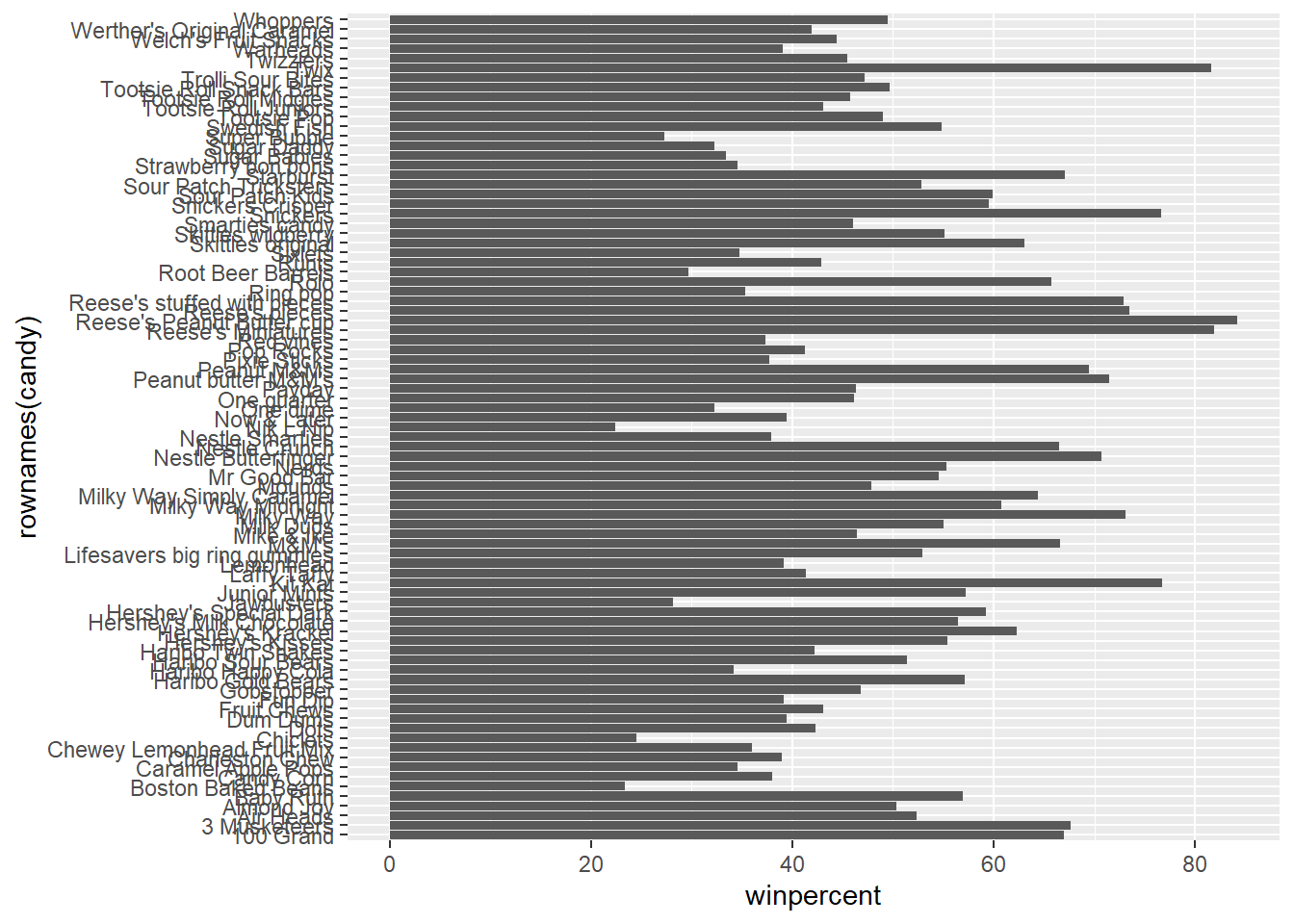
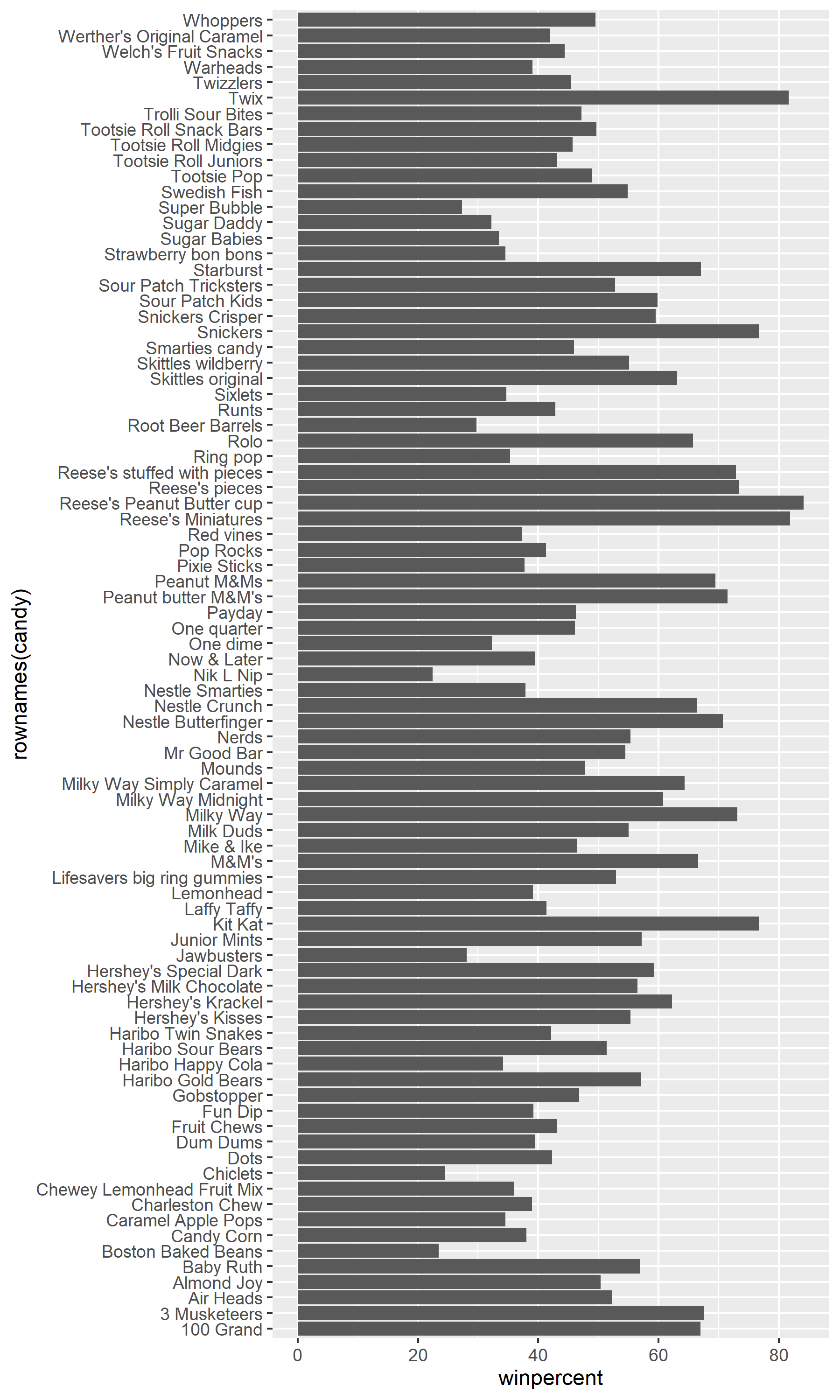
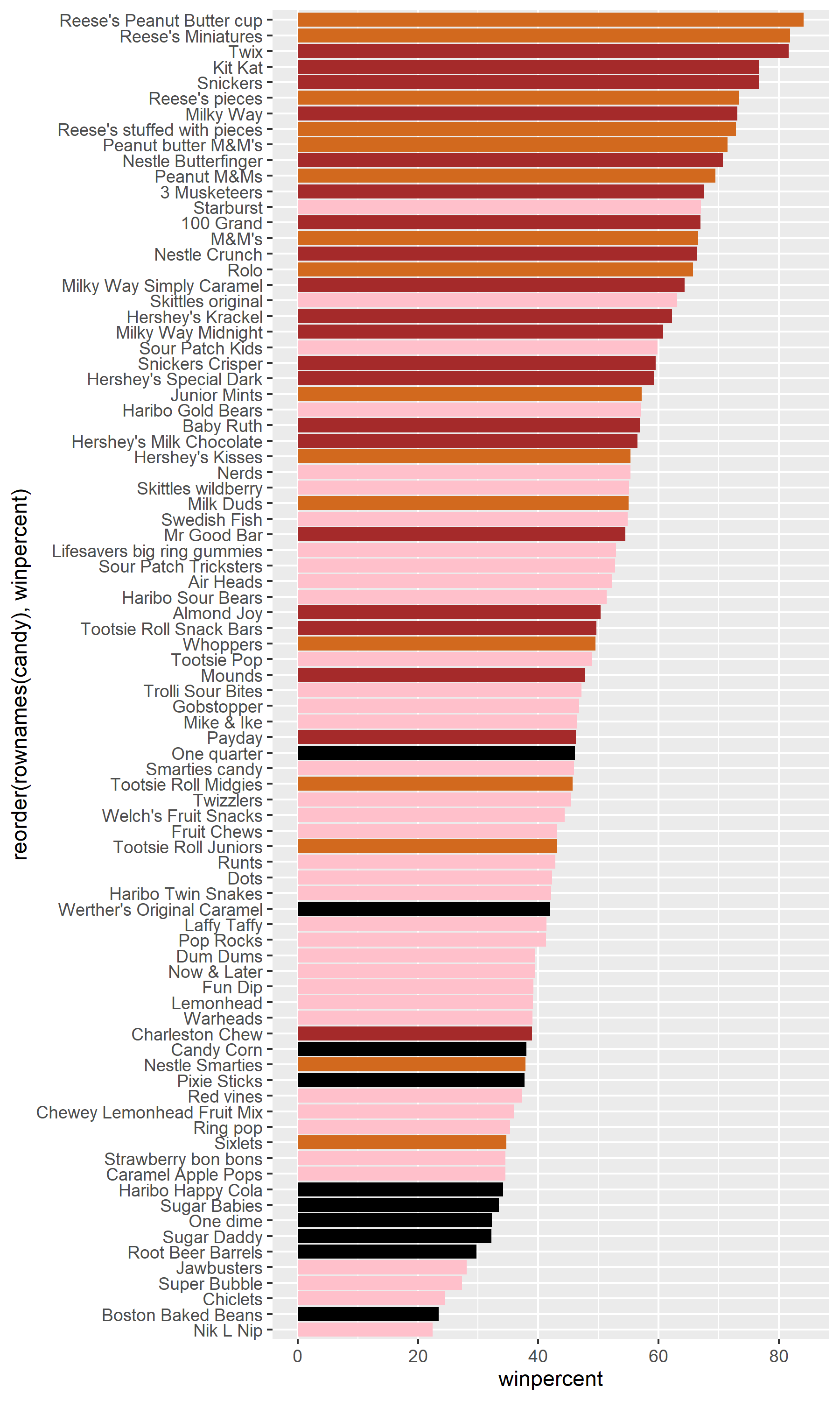
Q15. Make a first barplot of candy ranking based on winpercent values.
library (ggplot2)ggplot (candy) + aes (winpercent, rownames (candy)) + geom_col ()ggsave ("barplot1.png" , height= 10 , width= 6 )
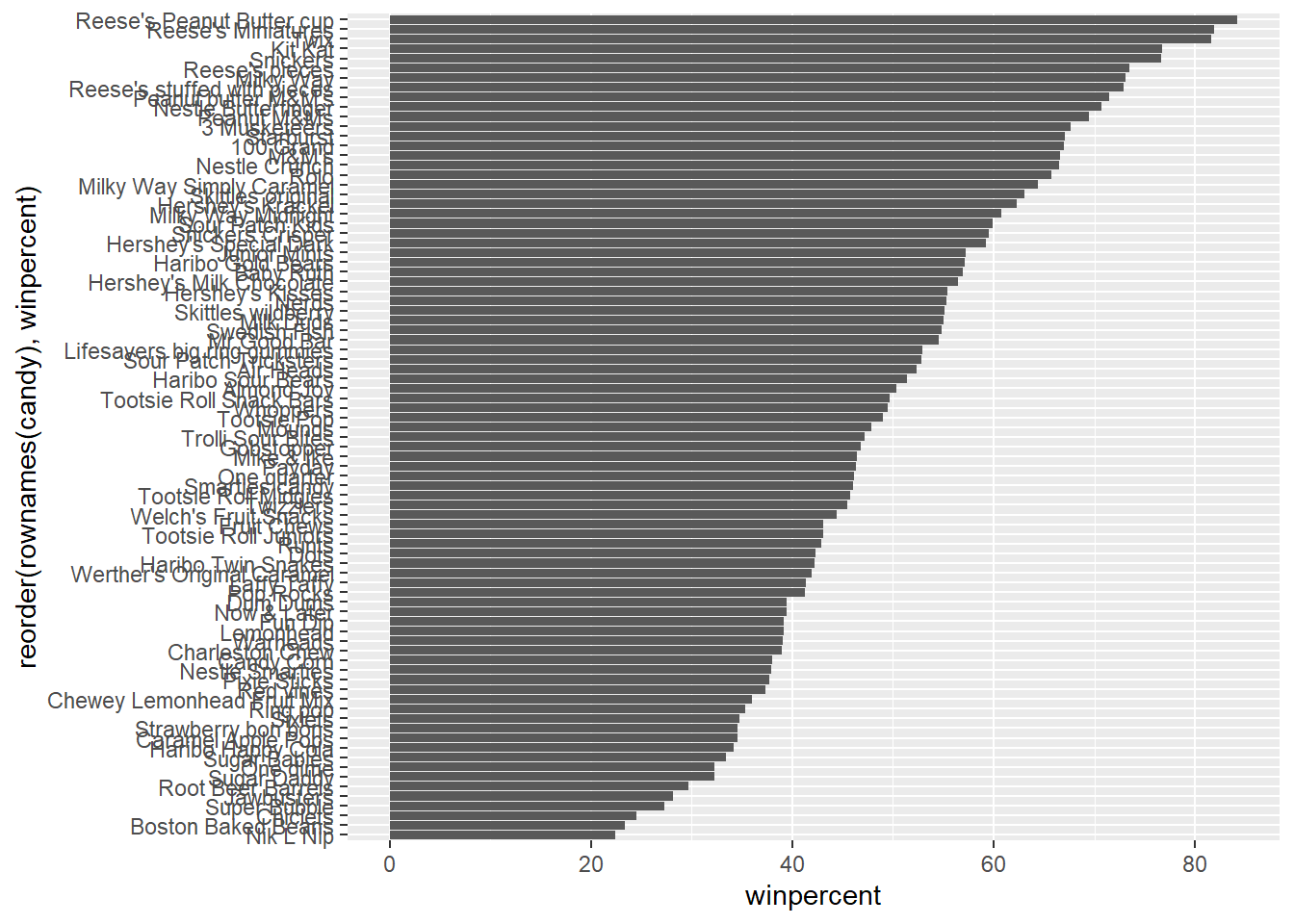
Q16. This is quite ugly, use the reorder() function to get the bars sorted by winpercent?
ggplot (candy) + aes (winpercent, reorder (rownames (candy),winpercent)) + geom_col () ggsave ("barplot2.png" , height= 10 , width= 6 )
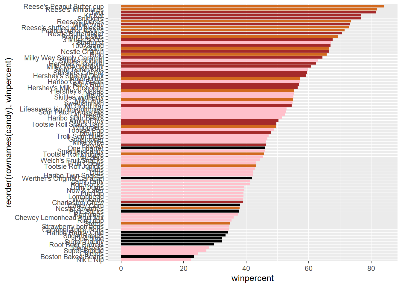
Q17. What is the worst ranked chocolate candy?
= rep ("black" , nrow (candy))as.logical (candy$ chocolate)] = "chocolate" as.logical (candy$ bar)] = "brown" as.logical (candy$ fruity)] = "pink"
ggplot (candy) + aes (winpercent, reorder (rownames (candy),winpercent)) + geom_col (fill= my_cols) ggsave ("barplot3.png" , height= 10 , width= 6 )
The worst ranked chocolate is sixlets
Q18. What is the best ranked fruity candy?
The best ranked fruity candy is starburst
Taking a look at pricepercent
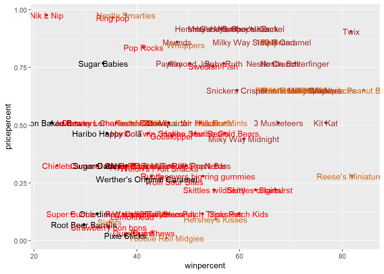
Make a plot of winpercent vs the pricepercent
as.logical (candy$ fruity)] = "red" ggplot (candy) + aes (x= winpercent, y= pricepercent, label= rownames (candy)) + geom_point (col= my_cols) + geom_text (col= my_cols)
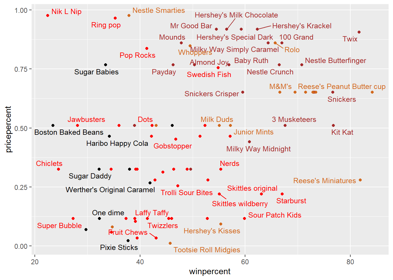
We can use ggrepel package for better label placment:
library (ggrepel)as.logical (candy$ fruity)] = "red" ggplot (candy) + aes (x= winpercent, y= pricepercent, label= rownames (candy)) + geom_point (col= my_cols) + geom_text_repel (col= my_cols, max.overlaps = 8 , size = 3.3 )
Warning: ggrepel: 32 unlabeled data points (too many overlaps). Consider
increasing max.overlaps
Q19. Which candy type is the highest ranked in terms of winpercent for the least money - i.e. offers the most bang for your buck?
Q20. What are the top 5 most expensive candy types in the dataset and of these which is the least popular?
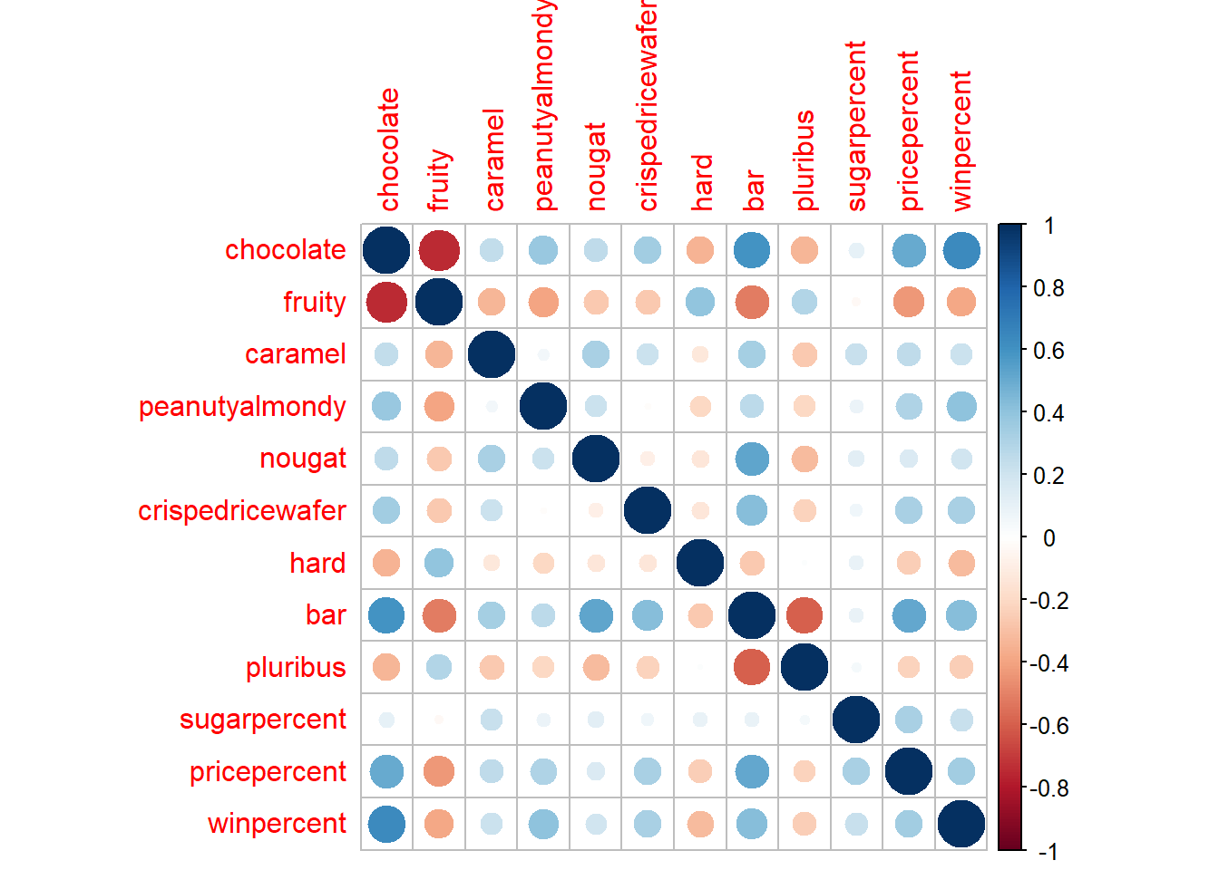
Exploring the correlation structure
Pearson correlation values range from -1 to +1
<- cor (candy)corrplot (cij)
Principal Component Analysis
<- prcomp (candy, scale= T)summary (pca)
Importance of components:
                          PC1    PC2    PC3     PC4    PC5     PC6     PC7
Standard deviation     2.0788 1.1378 1.1092 1.07533 0.9518 0.81923 0.81530
Proportion of Variance 0.3601 0.1079 0.1025 0.09636 0.0755 0.05593 0.05539
Cumulative Proportion  0.3601 0.4680 0.5705 0.66688 0.7424 0.79830 0.85369
                           PC8     PC9    PC10    PC11    PC12
Standard deviation     0.74530 0.67824 0.62349 0.43974 0.39760
Proportion of Variance 0.04629 0.03833 0.03239 0.01611 0.01317
Cumulative Proportion  0.89998 0.93832 0.97071 0.98683 1.00000
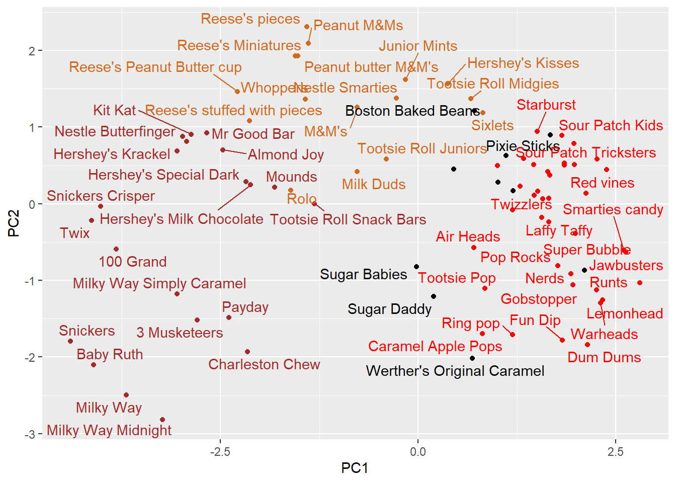
The main results figure: the PCA score plot:
ggplot (pca$ x) + aes (PC1, PC2, label= rownames (pca$ x)) + geom_point (col= my_cols) + geom_text_repel (col= my_cols)
Warning: ggrepel: 23 unlabeled data points (too many overlaps). Consider
increasing max.overlaps
labs (title= "PCA Candy Space Map" )
<ggplot2::labels> List of 1
 $ title: chr "PCA Candy Space Map"
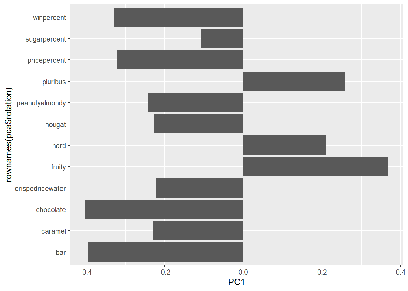
The “loadings” plot for PC1
ggplot (pca$ rotation) + aes (PC1, rownames (pca$ rotation)) + geom_col ()
Q24. Complete the code to generate the loadings plot above. What original variables are picked up strongly by PC1 in the positive direction? Do these make sense to you? Where did you see this relationship highlighted previously?
Q25. Based on your exploratory analysis, correlation findings, and PCA results, what combination of characteristics appears to make a “winning” candy? How do these different analyses (visualization, correlation, PCA) support or complement each other in reaching this conclusion?